
はじめに
みんな大好きplt.plot()の話です.
色指定は,"color="で簡単に覚えられますが,markerやlineスタイルのオプションって忘れがちですよね.もちろん僕も完全には把握していません.
そこで,今回はmerkerとlineスタイルオプションについて.
公式ドキュメント(matplotlib.pyplot.plot — Matplotlib 3.0.0 documentation)だと,サンプル画像がないので実際に全部試してみました.備忘録ついでに紹介します.
スタイル一覧
基本的にはmarkerやlineそれぞれ以下のオプションがデフォルトで使用可能.
marker style
| character | description |
|---|---|
| ‘.’ | point marker |
| ‘,’ | pixel marker |
| ‘o’ | circle marker |
| ‘v’ | triangle_down marker |
| ‘^’ | triangle_up marker |
| ‘<‘ | triangle_left marker |
| ‘>’ | triangle_right marker |
| ‘1’ | tri_down marker |
| ‘2’ | tri_up marker |
| ‘3’ | tri_left marker |
| ‘4’ | tri_right marker |
| ‘s’ | square marker |
| ‘p’ | pentagon marker |
| ‘*’ | star marker |
| ‘h’ | hexagon1 marker |
| ‘H’ | hexagon2 marker |
| ‘+’ | plus marker |
| ‘x’ | x marker |
| ‘D’ | diamond marker |
| ‘d’ | thin_diamond marker |
| ‘|’ | vline marker |
| ‘_’ | hline marker |
line style
| character | description |
|---|---|
| ‘-‘ | solid line style |
| ‘–‘ | dashed line style |
| ‘-.’ | dash-dot line style |
| ‘:’ | dotted line style |
これらのすべての組み合わせを試してみる.
コード
notebookの実行結果をそのまま貼り付けます...
In [1]:
import numpy as np
import pandas as pd
import math
import matplotlib.pyplot as plt

import matplotlib as mpl
mpl.rcParams["figure.max_open_warning"]=0
In [2]:
%matplotlib inline
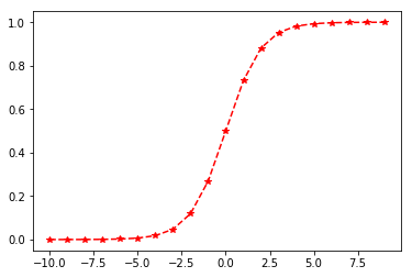
#今回はsigmoid関数をサンプルにする
def sigmoid(a):
s = 1 / (1 + e**-a)
return s
#適当にサンプルを作成
x = np.arange(-10, 10, 1)
e = math.e
y = sigmoid(x)
In [3]:
#一番よく見る形
plt.plot(x, y)
Out[3]:

In [4]:
#グラフスタイルをいろいろ変更可能
plt.plot(x, y, "*--", color="red")
Out[4]:

In [5]:
#選択可能なオプションの辞書を作成しておく
marker_dic = {
    ".":"point marker",
    ",":"pixel marker",
    "o":"circle marker",
    "v":"triangle_down marker",
    "^":"triangle_up marker",
    "<":"triangle_left marker",
    ">":"triangle_right marker",
    "1":"tri_down marker",
    "2":"tri_up marker",
    "3":"tri_left marker",
    "4":"tri_right marker",
    "s":"square marker",
    "p":"pentagon marker",
    "*":"star marker",
    "h":"hexagon1 marker",
    "H":"hexagon2 marker",
    "+":"plus marker",
    "x":"x marker",
    "D":"diamond marker",
    "d":"thin_diamond marker",
    "|":"vline marker",
    "_":"hline marker"
    }

line_dic = {"-":"solid line style",
             "--":"dashed line style",
             "-.":"dash-dot line style",
             ":":"dotted line style"}
In [6]:
#描画関数
#少しトリッキーだが許してもらおう.
def make_fig(x, y, m):
    plt.figure()
    fig, (ax1, ax2, ax3, ax4) = plt.subplots(ncols=4, figsize=(20,4))
    i=1
    for line in line_dic.keys():
        tr_ax = eval("ax%i"%i)
        tr_ax.plot(x, y, "%s%s"%(m,line), markersize=12, color="black")
        #サンプルコードをグラフタイトルに設定
        tr_ax.set_title("plt.plot(x, y, \"%s%s\")"%(m,line), fontsize=20)
        i=i+1
    return True
In [7]:
#全組合せを描画
for m in marker_dic.keys():
    make_fig(x, y, m)


おわりに
雑ですが,一覧のような形で示せたので自分の備忘録としては満足です.
色だけで区別するのは限界があるので,こういったスタイルオプションも積極的に使ってわかりやすい図表作成を心掛けたいと思います.
図が小さくて見にくいので,もしかしたら修正するかも(初回投稿時のつぶやき)